03 When People Walk (Bike)

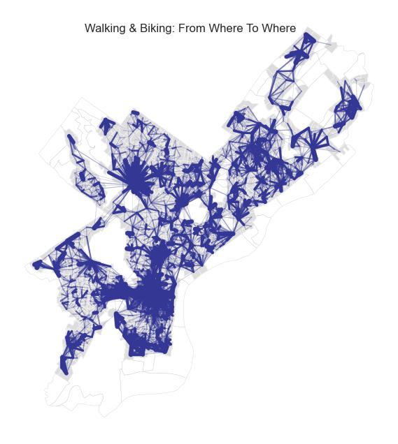
The above plot represents the aggregate flows by either walking or biking between pairs of block groups. These trips are generally short and revolve around neighborhood-level centers. But specifically, in what situation are people willing to walk or bike?
Mode and purpose
The below dashboard shows us the mode share by hour of day and by purpose. Click-select a trip purpose on the top graph, and see how mode share changes.
It is evident that school-related trips are the most likely to be by walking or biking. The other purposes do not differ much. This is validated in the below chart, which also shows that school trips are mostly on foot or bikes.
How far are people willing to walk/bike: simple logistic regression
To answer the question of when people choose to walk/bike, we introduced the key variable of distance. The longer the trip distance, the less likely people are willing to walk or bike. Therefore, by simply regressing the boolean variable of walk/bike on distance, we get a “likelihood” of walking or biking with each distance. The below chart demonstrates that school trips takers are the most willing to walk or bike: 50% chance even at 1.9 miles. The other purposes do not differ much. Click-select a purpose on the left plot and see what happens.
Mode and age
Similarly, we looked at age. The below two charts shows that the older you are, the less likely you are to walk or bike. Children under 18 years old are significantly more likely to walk or bike than all the adult age groups.
Mode and income
With income, low-income residents are much more likely to walk and bike than all the other income groups. Other than low-income residents, the other residents are roughly equally like to walk or bike regardless of income (which could be related to the general walk/bike preference in Philadelphia). This implies that low-income residents are forced to walk or bike more due to not owning a car and the possible low levels of service of public transit.
Walk/bike preferences across space
Are people in some places more likely to walk or bike than people in other places? Using the simple logistic regression, we estimated the threshold distance with 50% likelihood of walking/biking for each individual block group. This threshold distance is roughly normally distributed and is not very spatially autocorrelated, according to the chart and map below. This signifies that walk/bike preferences do not vary by geographical locations, but are more likely to be associated with a general preference of all people in Philadelphia.
Code excerpt
Code excerpt of using the simple logistic regression to estimate the likelihood to walk/bike by distance for each trip purpose.
def make_likelihood_dashboard(var_name, types, display_name):
  # Initiate a table to store results
  result_table = pd.DataFrame()

  # For each purpose, do a simple logistic regression
  # to see the probability of walking or biking associated with this purpose

  for this_type in types:

    # For each subset, do a logistic regression
    sel = df[var_name] == this_type
    df_sel = df.loc[sel]

    X = df_sel.trip_distance_miles.values
    X = X[:, np.newaxis]
    y = (df_sel.primary_mode.isin(['Walking', 'Biking']))

    logit_model.fit(X, y)

    y_pred = logit_model.predict_proba(X_pred)
    result_table[this_type] = y_pred[:, 1]

  # Find overall likelihood to walk or bike


  mean_table = df.groupby(var_name)['walk_bike'].mean()
  mean_table = mean_table.reset_index().rename(columns = {
    var_name: display_name,
    'walk_bike': 'Overall'
  })

  # Convert the results

  result = result_table.T
  result.columns = distance_steps

  result = result.reset_index().rename(columns = {'index': display_name})
  result = pd.melt(result, id_vars = [display_name], value_vars = distance_steps, value_name = 'Likelihood', var_name = 'Distance')

  # Start altair
  selection = alt.selection_multi(encodings = ['x'])

  category_chart = alt.Chart(mean_table.reset_index()).mark_bar().encode(
    x = alt.X(f'{display_name}:N', sort = types, title = ''),
    y = alt.Y('Overall:Q', title = 'Overall Likelihood to Walk or Bike'),
    color = alt.Color(f'{display_name}:N', title = display_name, scale = alt.Scale(
      domain = types,
      range = color_list[0:len(types) - 1] + color_list[-1:],
    )),
    tooltip = [
      alt.Tooltip(f'{display_name}:N', title = display_name),
      alt.Tooltip('Overall', title = 'Likelihood')
    ]
  ).add_selection(
    selection
  ).properties(
    width = 100,
    title = 'Click-select Category'
  )

  likelihood_chart = alt.Chart(result).mark_line().encode(
    x = 'Distance:N',
    y = 'Likelihood:Q',
    color = f'{display_name}:N'
  ).transform_filter(
    selection
  ).properties(
    width = 300
  )

  chart = category_chart | likelihood_chart
  chart.properties(
    title = 'Likelihood to walk by distance and purpose'
  )

  return chart

chart = make_likelihood_dashboard('trip_purpose', list(purpose_dict.values()), 'Purpose')